Emoji Battery: Status Bar Icon
- 4.5
- Rating
- 500.00K
- Installs
- Free
- Price

 Analysis by App-foxy
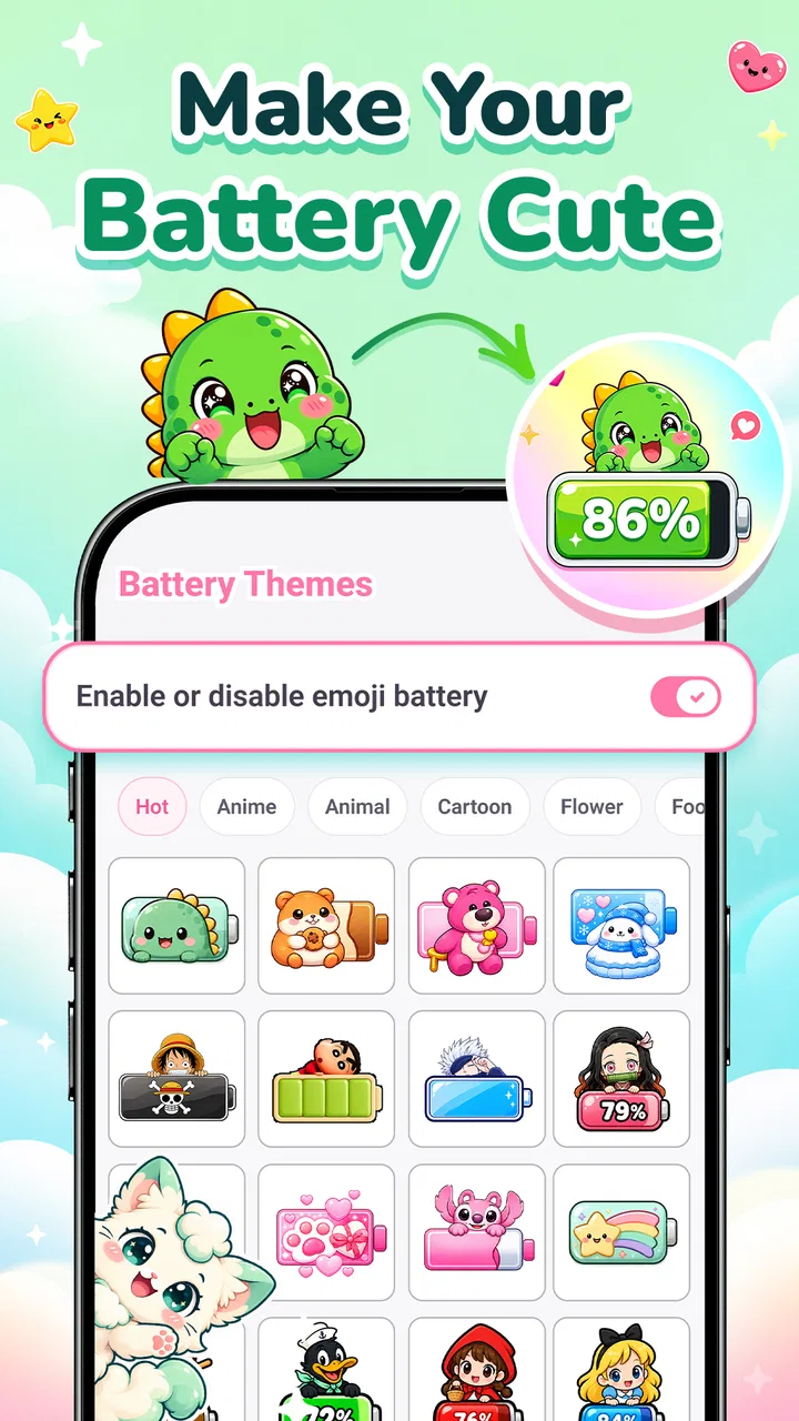
I tried Emoji Battery: Status Bar Icon as a small personalization tool rather than expecting it to transform the whole phone. That distinction matters. This is an app from TRUNGHIEUCOM built around making the battery indicator feel more playful, using emoji-style icons, cute stickers, and pet-themed visuals in the status bar. If you enjoy giving ordinary interface details a bit of character, the idea is immediately appealing. If you prefer a clean, information-first status bar, the same approach may feel unnecessary.
The app is free, carries an Everyone age rating, and is available for Android devices running version 7.0 or later. Its current version is 1.1.6. Those details make it easy to consider as a low-risk customization experiment: you can try the visual concept without treating it like a serious purchase decision. I would still approach it with realistic expectations. This is a focused personalization app, not a complete launcher replacement, icon pack, lock-screen suite, or battery-management utility.
What the app changes and how the experience feels
The central appeal is simple: replace the usual visual treatment of battery status with something more expressive. Instead of seeing the battery indicator as a purely functional symbol, you get a chance to make it match a cute, humorous, or more decorative phone style. The store summary points specifically to fun emoji battery icons, stickers, and pet icons, so the personality comes from the visual choices rather than from a large collection of unrelated phone tools.
You May Also Like

 AccuWeather: Weather Radar
AccuWeather Review: A Quick, Clear Forecast for Everyday Decisions
For everyday plans, the best forecast is the one you can understand quickly. AccuWeather makes rain timing, radar, and local conditions easy to act on, with a few trade-offs.

 Hill Climb Racing
Why Hill Climb Racing Still Turns Crashes Into One More Run
A tiny car, a bumpy hill and one more upgrade: Hill Climb Racing keeps resurfacing because its simple chaos makes every near-miss feel personal.

 AliExpress - Shopping App
AliExpress Makes Global Shopping Feel Personal, but Shoppers Bear the Risk
AliExpress turns a global marketplace into a pocket-sized discovery engine. Its reach is useful, its shopping loop compelling, and its trade-offs easy to miss.

 Lords Mobile: Kingdom Wars
Lords Mobile Is a Kingdom-Building Routine, Not a Quick Match
A case-by-case verdict on the building, battles, device demands, and social commitments that make Lords Mobile rewarding for some players and exhausting for others.

 PDF Scanner app - TapScanner
TapScanner Makes Paperwork Easier to Capture, Check, and Share
TapScanner makes scanning with a phone feel less like a rescue operation and more like a dependable step in getting work done. Its capture tools are useful, though not flawless.

 Block Blast!
 Shows How Much a Puzzle Game Can Leave Out
A quiet grid game shows why puzzle players increasingly value instant clarity, repeatable skill and low-pressure play—and where the genre still needs to catch up.
More From Our News Desk
View All News


That narrow focus is one of the app’s strengths. I did not have to learn a complicated customization system or redesign the entire home screen just to make one small part of the interface more personal. The concept works particularly well for someone who already uses playful wallpapers, themed widgets, or colorful chat backgrounds and wants the status bar to feel less generic.
At the same time, a status bar is a crowded area. Time, signal, Wi-Fi, notifications, and other system symbols compete for attention there. A decorative battery treatment has to remain recognizable at a glance. My practical advice is to choose the clearest icon style first, then move toward more elaborate stickers or pet designs only if the battery level remains easy to read. A charming symbol is not useful if you have to stop and interpret it every time you check your charge.
That is the first non-obvious trade-off: personalization has a visibility cost. The most decorative option may be the least convenient during a busy day, while a simpler emoji can preserve the quick recognition people expect from a battery indicator. I would judge each design at the phone’s normal viewing distance, not only while browsing the app’s selection screen.
Free access makes experimentation the main value
There is no purchase price attached to the app, so its value is best understood as free access to a small visual change. That does not mean it will be valuable to everyone. A free app can still be a poor fit if it adds clutter or does not suit the phone’s existing style. In this case, the absence of a price makes trying it more comfortable, especially for users who are curious about emoji battery icons but do not want to commit money to a narrow customization.
I would not describe it as a money-saving alternative to a paid personalization suite because those products may offer a much broader range of controls. The fair comparison is different: this app gives you a focused way to test one idea without paying for a complete theme ecosystem. If that single change is all you want, free access is meaningful. If you want coordinated control over icons, fonts, widgets, wallpapers, and navigation elements, you may find the scope too limited even though the download costs nothing.
The app’s audience size also suggests that the concept has found interest beyond a tiny group. It has passed one hundred thousand installs and holds a 4.4 average from around nine hundred ratings, with a few dozen written reviews. I treat those figures as a sign that the basic idea is resonating, not as proof that every device will display it identically. Personalization tools often depend on the phone’s Android version, manufacturer interface, and status-bar behavior, so the visual result can be more important than the headline rating.
Everyday use: a small change that can work surprisingly well
Imagine checking your phone during a commute or while waiting for a message. You glance at the top edge to see whether you need a charger before leaving. A familiar pet face or expressive emoji can make that routine feel more personal, but the useful part is still the battery-level cue. I think the app works best in that kind of repeated, low-effort interaction: it adds a bit of mood to something you already look at several times a day.
It can also suit a shared family tablet, a child-friendly device, or a phone with a deliberately cheerful theme. The Everyone rating makes the presentation approachable for a broad audience, although adults who prefer understated interfaces may find the same designs too playful. For a gift setup, I could see choosing a friendly battery icon as a small finishing touch after setting a wallpaper and arranging the home screen.
Another useful workflow is to treat the icon as a visual reminder rather than decoration alone. A distinctive low-battery design may prompt you to charge sooner than a tiny conventional symbol would. That is not a battery-saving feature, and I would not use it as a substitute for the phone’s actual percentage or charging controls. It is simply a more noticeable cue for people who tend to ignore standard system symbols.
How it compares with normal Android customization
Android already gives many users a standard battery icon, percentage display, and system-level appearance controls. Those built-in options are usually better when accuracy, consistency, and minimal distractions matter most. They are also the safer choice for someone who wants the battery state to look exactly like the rest of the operating system.
Emoji Battery: Status Bar Icon takes the opposite approach. It is less about blending into Android and more about adding a visible personal touch. Compared with a full launcher or theme application, it is lighter in purpose and easier to understand. Compared with the default battery indicator, it offers more personality but potentially less visual restraint. Compared with a general wallpaper app, it changes a functional interface element instead of only the background.
That comparison helps define the right buyer, even though there is no purchase involved. Choose the built-in system option when you want dependable simplicity. Choose a broad theme app when you want every part of the interface coordinated. Choose this app when the status bar itself is the detail you want to make more expressive.
Small decisions that improve the result
I would begin with one icon style and use it for a full day before deciding whether the app is successful for you. The first few minutes can make any unusual design feel exciting, but daily use reveals whether it remains readable beside other status symbols. This is especially important if you frequently check the phone outdoors, use a bright wallpaper behind translucent interface elements, or rely on quick glances rather than opening the battery settings.
A second practical tip is to match the visual weight of the icon to the rest of the phone. A tiny, simple emoji can look intentional beside a restrained wallpaper, while a large pet-themed symbol may work better with colorful widgets and a playful lock screen. Mixing a very decorative battery design with an otherwise minimal setup can make the status bar feel visually disconnected.
Third, I would avoid judging the app only by its most eye-catching option. The best everyday choice may be the icon that communicates charge level fastest, not the one that looks most unusual in a screenshot. This is where a focused customization app benefits from a little restraint: the feature is more successful when it stays useful after the novelty wears off.
Where the experience may become frustrating
The main limitation is that the app’s purpose is narrow. If you are looking for battery health information, charging schedules, power-saving controls, or detailed usage analysis, this is not the right tool. Its role is visual personalization. Expecting it to improve battery life or explain why a phone is draining quickly would lead to disappointment.
There is also a natural compatibility question with any app that changes how a system-area indicator appears. Android phones do not all handle status bars in exactly the same way, and manufacturer interfaces can apply their own layout rules. I would therefore test the result after changing orientation, switching between light and dark interface styles, and checking the phone with several notifications present. Those situations reveal whether the icon remains easy to see when the status bar is busy.
Another friction point is information density. Some users want the exact percentage visible at all times. A decorative icon may not satisfy that preference unless the phone’s own settings continue to show enough numerical information. For me, the best arrangement is one where the playful design adds character without forcing me to open a menu whenever I need precision. If your priority is an exact number rather than a visual cue, the standard system display is likely the better answer.
I would also skip it if you dislike interface changes that draw attention. Not every phone needs a cute status bar, and there is no benefit in customizing a feature you rarely notice. The app makes sense for someone who enjoys visual details; it is less convincing for someone who sees the status bar only as a source of technical information.
Who will get the most from it
The strongest audience is people who enjoy small, reversible personalization choices. That includes users building a cute phone theme, fans of emoji and pet imagery, and anyone who wants a more cheerful alternative to the standard battery symbol. It may also appeal to people setting up a secondary device where personality matters more than a strictly uniform system appearance.
It is a particularly sensible trial for users on older supported Android phones. The minimum operating-system requirement reaches back to Android 7.0, so the app is not limited only to recent devices. Still, support at the operating-system level does not guarantee that every manufacturer skin will present the result in precisely the same way. I would install it with the expectation of checking the actual status bar on your own phone rather than assuming another device’s appearance will be identical.
People who should skip it are just as clear. If you want a professional, quiet interface, if you need a precise battery percentage more than a decorative symbol, or if you are searching for genuine power-management tools, the default Android controls will probably serve you better. A full personalization suite is also a better match for anyone who wants a unified redesign rather than one expressive detail.
My verdict on the free value
My opinion is favorable, but it is specific: this is a worthwhile free experiment for users who genuinely want emoji, sticker, or pet-inspired battery visuals. The app delivers value through personality and simplicity, not through deeper battery functionality. Because there is no purchase price to weigh, the decision comes down to whether that visual change improves your daily interaction or merely adds noise.
The 4.4 average and more than one hundred thousand installs make it easier to take the concept seriously, while the current 1.1.6 release suggests the app is an actively identifiable product rather than an abandoned curiosity. I would still keep the judgment personal. A rating cannot tell you whether a particular icon will remain legible on your handset, and a large install count cannot replace a short real-world test.
My recommendation is to try it if your phone already has a playful look, then evaluate the chosen battery icon during normal use, with notifications visible and the battery level changing throughout the day. Keep it when the design gives you a quick, pleasant cue without hiding useful information. Remove it when the status bar becomes harder to read or feels out of place. The best reason to use Emoji Battery: Status Bar Icon is not that it adds more technology; it is that it makes one ordinary phone detail feel more like yours.
FAQs for Emoji Battery: Status Bar Icon
01What is Emoji Battery: Status Bar Icon and how does it work?
Emoji Battery: Status Bar Icon is a customization app that represents your device’s battery level with an emoji-style icon in or around the status bar area. After installation, you typically choose a preferred emoji or visual style and allow the required permissions. The app then updates the indicator as the battery percentage changes, giving your phone a more playful appearance than the standard battery symbol.
02Does Emoji Battery: Status Bar Icon work on every Android phone?
Compatibility can vary depending on your Android version, phone manufacturer, launcher, and status-bar design. Some devices allow the app to display an overlay or notification-based indicator, while heavily customized interfaces may restrict how icons appear. Before downloading, check the app’s Play Store requirements and test whether your phone permits overlay, notification, or accessibility-related features needed for the selected display mode.
03What permissions does Emoji Battery: Status Bar Icon require?
The permissions depend on the way the app places the battery emoji on your screen. It may request permission to display over other apps, post notifications, run in the background, or use accessibility features on certain devices. These permissions should be reviewed carefully during setup. If you are uncomfortable granting them, avoid enabling optional features and use only the least intrusive display method available.
04Will Emoji Battery: Status Bar Icon drain my battery or slow down my phone?
The app is designed to monitor battery changes and refresh its indicator, so its impact is usually limited when configured correctly. However, background activity, persistent notifications, overlays, or accessibility services can consume additional resources on some phones. If you notice unusual battery usage, delayed performance, or repeated notifications, review the app’s update frequency, disable unnecessary options, and check Android’s battery-usage settings.
05Can I customize the emoji battery indicator and remove it later?
Most versions provide customization options such as choosing an emoji or icon style, adjusting its appearance, and deciding how it should be shown. Available settings may differ by device and Android version. You can normally disable the indicator from inside the app or revoke its permissions through Android Settings. Uninstalling the app should remove its related service, notification, and overlay completely.
Pros
- Shows battery percentage through a fun
- customizable emoji icon.
- Uses very little battery because it runs as a lightweight status tool.
- Offers quick visual battery checks without opening the notification panel.
- Simple setup makes it accessible for users with limited technical experience.
- Useful for personalizing otherwise plain Android status bar information.
Cons
- Some emoji styles may be difficult to distinguish at a quick glance.
- Status bar behavior can vary between Android brands and system versions.
- Background restrictions may stop updates on aggressively optimized devices.
- Customization options may be limited without upgrading or viewing ads.
- The icon can become crowded alongside other status bar notifications.

Emoji Battery: Status Bar Icon
Gallery